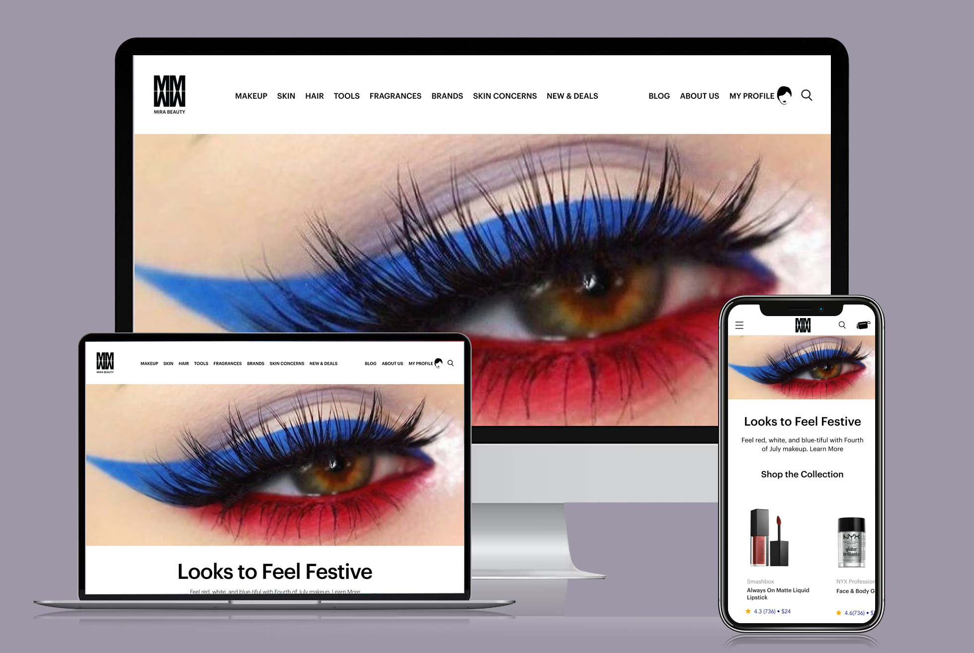
The “Netflix” of Beauty, All In One Place
— MIRA Beauty AI
UX Case Study
Roles
Regina Rakhlin - CX Strategy / UX Director / Designer
Arundhati Sampath - Chief Product Officer
Benjamin Lord - Chief Marketing Officer
Brandon Garcia - Chief Operating Officer
Jay Hack - Chief Executive Officer
Client
MIRA Beauty AI
KPI
Build an engaging eCommerce experience to drive conversion.
The Challenge
An AI platform startup, enabling a personalized beauty experience. Eliminating the customer’s burden to research before purchasing. MIRA has done all that work, creating a transparent & authentic beauty retailer. Empowering customers with knowledge from their blog and beauty solutions more quickly, easily, and inclusively than ever before.
• • •
Hypothesis
We believe by creating a personalized & transparent experience for the MIRA customer, will showcase MIRA Beauty as a legitimate and trusted retail destination for all things beauty.
We’ll know this is true when there will be a conversion increase & repeat visits.
01 : Understand
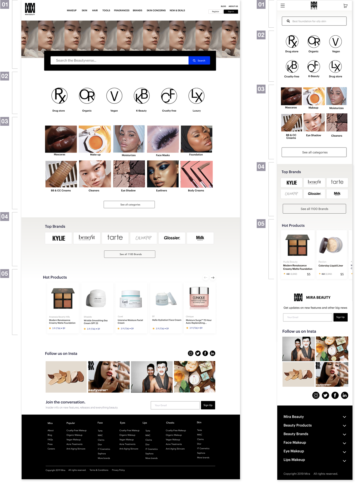
Homepage Opportunities
01
Simplify the global header. Create a branded and elevated banner, while maintaining prominence of search.
• • •
02
Introduce the customer to the section and what might they expect when shopping by Lifestyle.
• • •
03
Create an engaging experience while communicating the abundant product categories to browse.
• • •
04
A wide array of reputable brands presented with authority and sophistication.
• • •
05
Personalized trending products based on a customer’s browsing history and demonstrated interest.
Search Results Opportunities
01
Optimized use of space. Associate related elements. Type & element hierarchy.
• • •
02
Product image alignment, elevated display, relative scale and consistent presentation.
• • •
03
Simplified presentation. Associate relative elements. Enable ease for scanning.
• • •
04
Create a predictable grid. Simplify for a cleaner and elevated presentation for complex content.
• • •
01
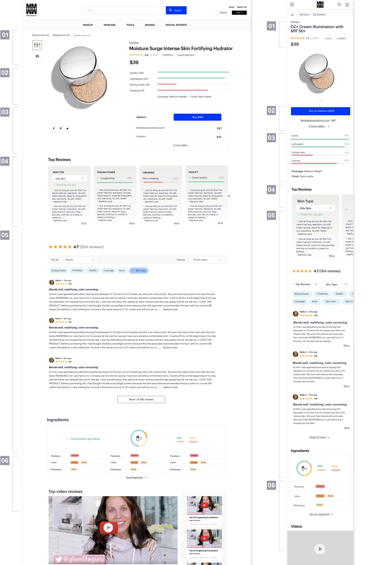
Simpler, organized, hierarchical information architecture.
• • •
02
Integrate this information into a more relevant section of the page.
• • •
03
Clearer price comparison and actual customer cost.
• • •
04
Eliminate content redundancy. Integrate unique elements.
• • •
05
Improved readability and filtering capabilities.
• • •
06
Current presentation isn’t understood by customers.
02 : Ideate
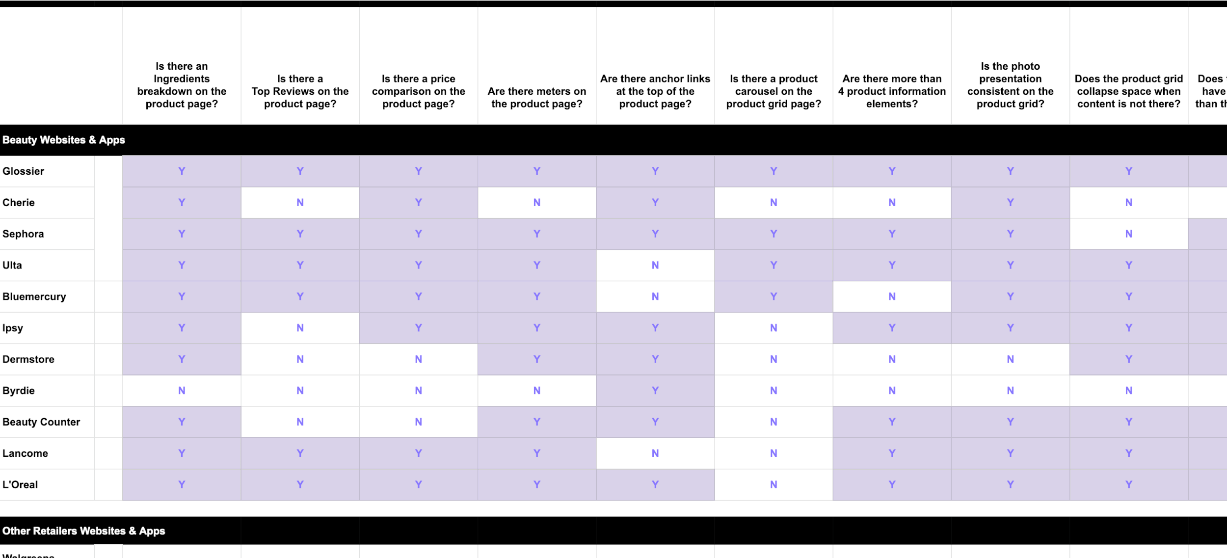
Knowing the target objective and the problem to solve, researching the marketplace would be the next step. Conducting a (direct/indirect) competitive analysis assists in informing design recommendations to share with users and stakeholder for feedback.
• • •
While analyzing the current state of the site elements & components, I realized there was great opportunity for type, color, grid & spacing optimization and consistency in the design system. Even though the site had a design system, it was apparent it needed to be revisited.
Typography
Improve overall type hierarchy by adding sizes and style ranges, while eliminating unnecessary, close type sizes.
Color Palette
Optimize the use of colors being used. Update colors which did not support an elevated presentation of the brand. The code had 15+ grays on the product page alone. These could have been easily consolidated into 3. The type using “black” optically appeared to be rendering soft, upon closer investigation, the color was not 100% black and seemed to have no reason for not being so.
Grid & Spacing
There was no underlying grid to these pages and the spacing was not consistent. To enable an easier time for the developers and a more comprehensive system of associating elements, an 8px spacing system was used. A flexible grid was also leveraged using this spacing system.
03 : Prototype
The following design options were put together to share with customers and get insight on brand perception and general understanding. The kinds of insights we were seeking were general beauty shopping habits, types of products are typically purchased.
Then would take customers to the homepage to get a general impression of the brands via the website. Typically customers arrive to the site via google search, primarily via google image.
Looking to optimize customer engagement on the site, once they arrive and ultimately drive to conversion.
Search Results Page
▲ Original Design
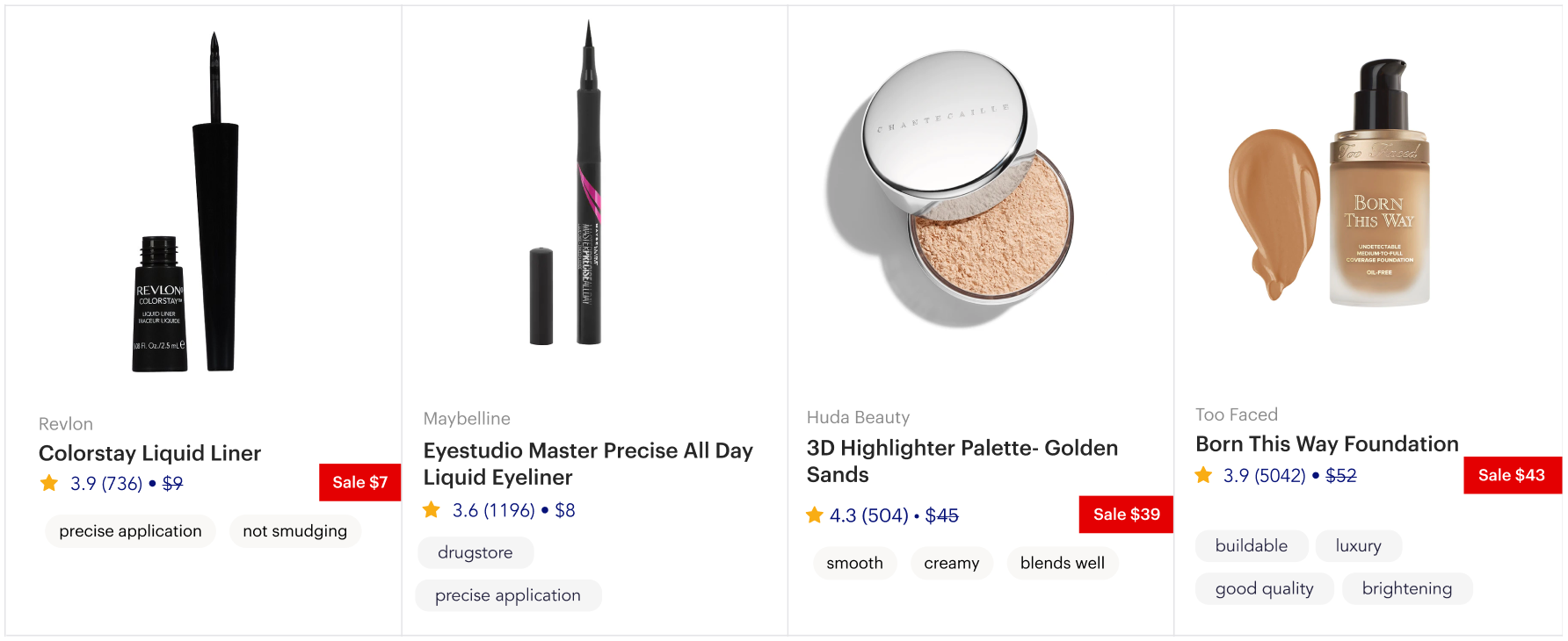
The enhancement objective was to create a sale experience for the product grid. In doing so, all existing elements should be maintained. The new design should follow UX + UI design best practices for an elevated brand presentation.
▼ Design Sprint 01
The objective of this sprint was to develop a design treatment for sale pricing. The design options ranged from simplest execution (not always the best MVP) to the most extreme. This would allow for a conversation and a better understanding of where the stakeholders feel is our best foot forward to start.
Sprint 01 : Option 01
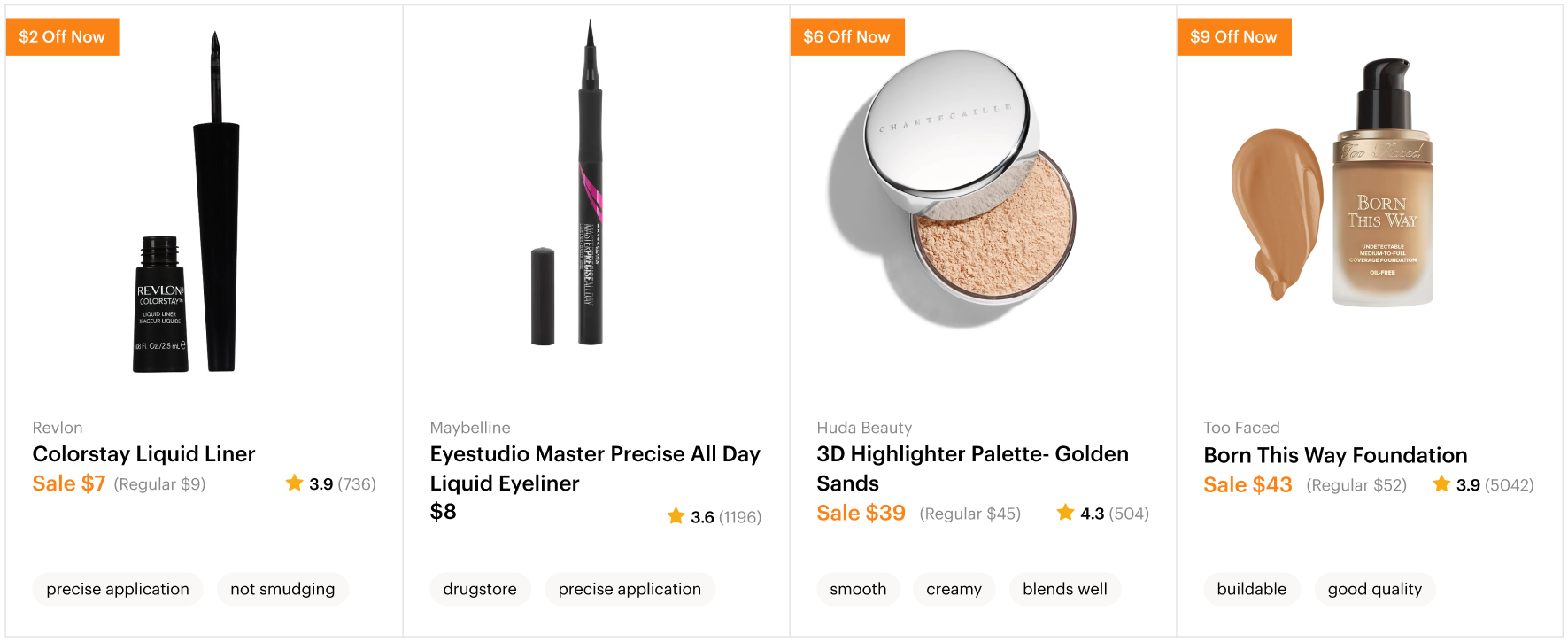
Keeping the basic design the same, this design added a sale tag treatment, in close proximity to the original price with a strikethrough.
Sprint 01 : Option 02
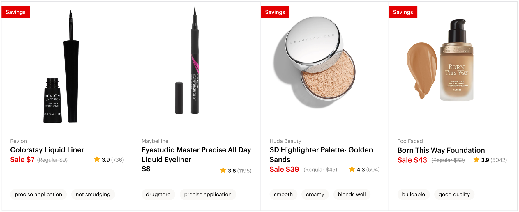
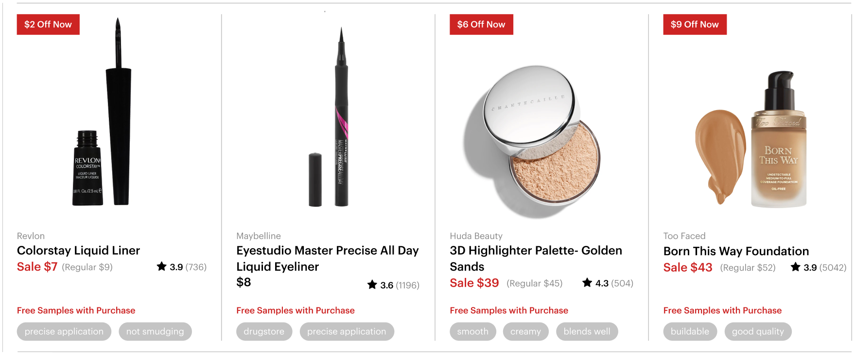
A new element was being added to an already complex component. The objective was to maintain all the elements, but simplify the presentation to enable the customer to scan the page with greater ease. The new design system was leveraged in this design option. The price was made larger and moved closer to the product name, while ratings was moved to the right margin. The Sale price and tag were visually associated by color. The tag was also placed in a fix location for less visual noise. The attribute tags were also cleaned up and position at the based of the component.
Sprint 01 : Option 03
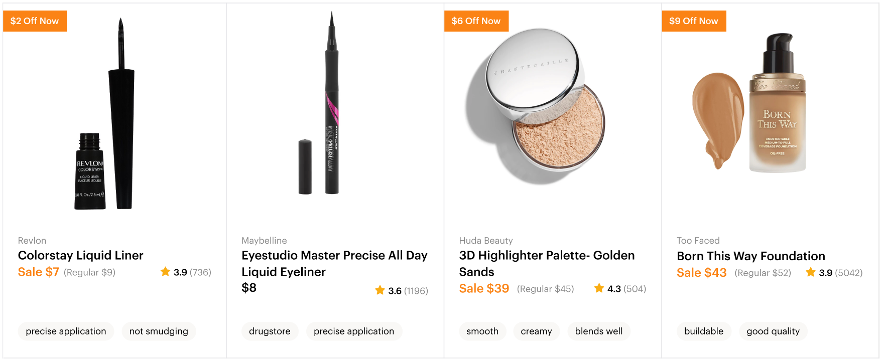
Starting from Option 02, there were a couple elements, I felt could have been improved. The Savings tag felt a bit repetitive and did not add value. Might it be useful for the customer to know the dollars savings they are getting for each item? The other variation was the original price strikethrough was removed to easily see and compare to the sale price.
Sprint 01 : Option 04
Not being sure if the stakeholders wish to have a more prominent sale callout, this option was created. The text could be testing in any of these options. The options were more for placement and design presentation.
▼ Design Sprint 02
After an internal design review with stakeholders option 03 was the preferred design. Based on their feedback and personal thoughts, addition design options were created.
Sprint 02 : Option 01
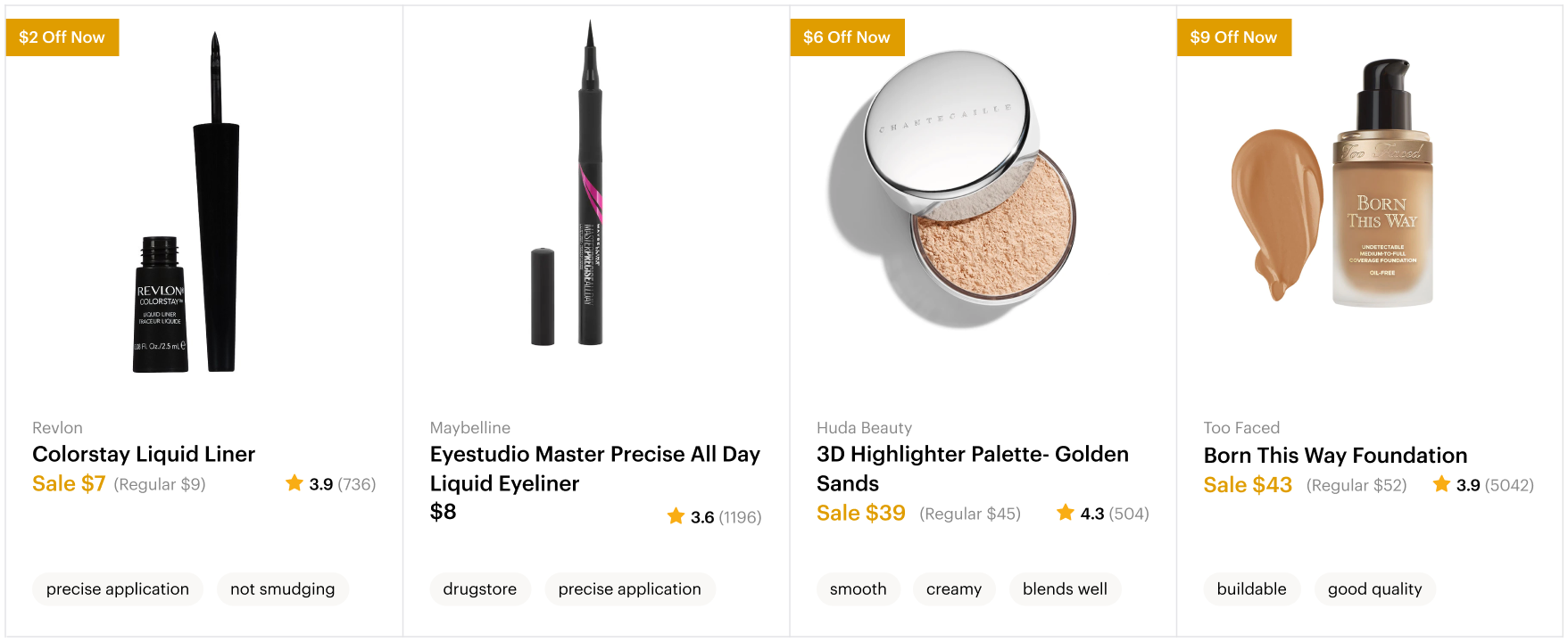
Being the brand color was a vibrant blue, having red with it didn’t feel very elevated. Typically red is a great color for sale, but other colors were explored one of which was orange.
Sprint 02 : Option 02
The design also needed to include all product elements variations to account for these scenarios. In addition to the product component, there was a request to have a carousel in the grid. Based on how the existing grid was designed, the UI did not look like it could move. It looked fixed as all the rules were attached and stationary. In this option, all the rules were removed and the elements within the product card created association.
Sprint 02 : Option 03
If having no lines might be too extreme, this option maintained the rules, they would not connect to provide a less fixed presentation and motion and easily be applied.
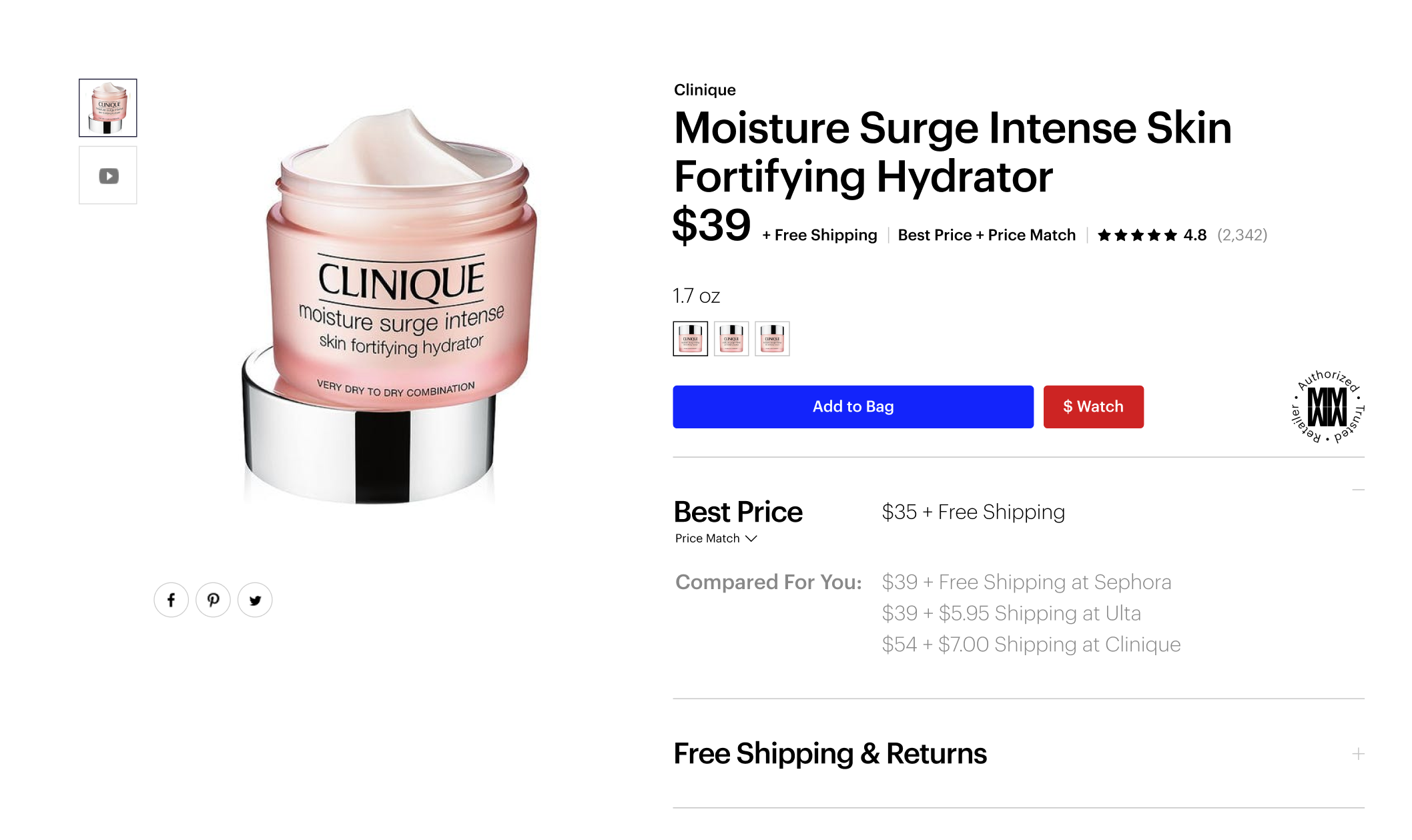
Product Page [Top]
Original Design ▶
The effort and objective was focused on customer insights based on user interviews from the prior week. Additionally keeping in mind the limited developer resources.
• • •
▼ Design Sprint 01
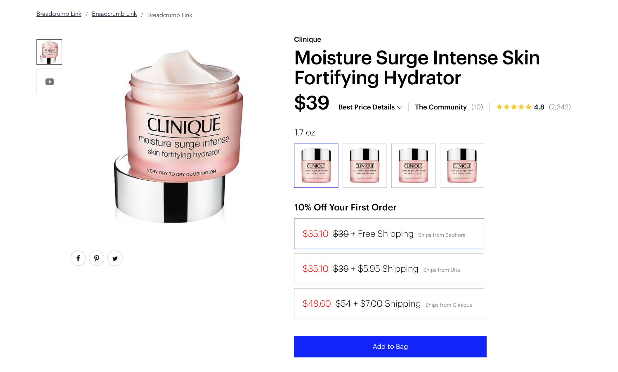
During this sprint the goal was to enable customers to see the price comparison with the ability to select their preference. Since the page is long, providing the ability to see an overview of the contents and ability to navigate to the desired section of the page.
Sprint 01 : Option 01
Sprint 01 : Option 02
Sprint 01 : Option 03
Sprint 01 : Option 03
▼ Design Sprint 02
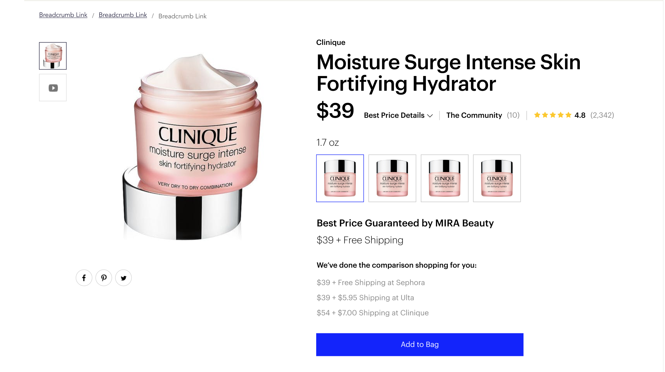
The designs above were shared with participants during a user interview session. While business felt it wanted to offer customers to select any of the price comparison options, the customers felt just seeing them was enough. The business requested design options for a more prominent price.
Sprint 02 : Option 01
Sprint 02 : Option 02
▼ Design Sprint 03
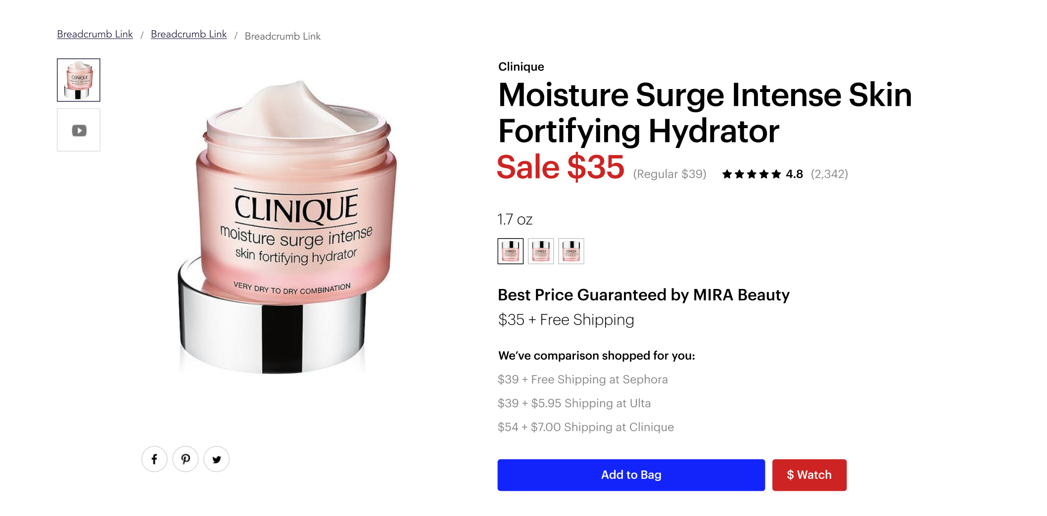
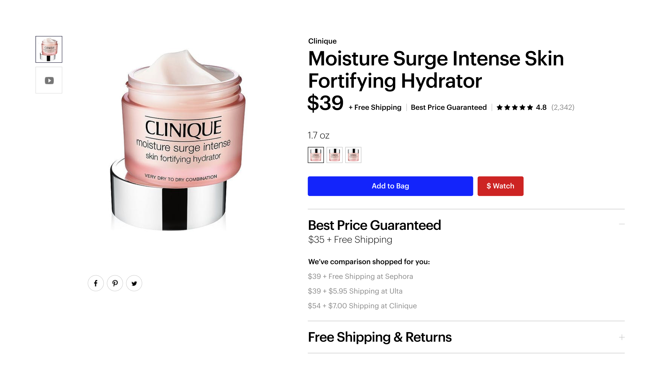
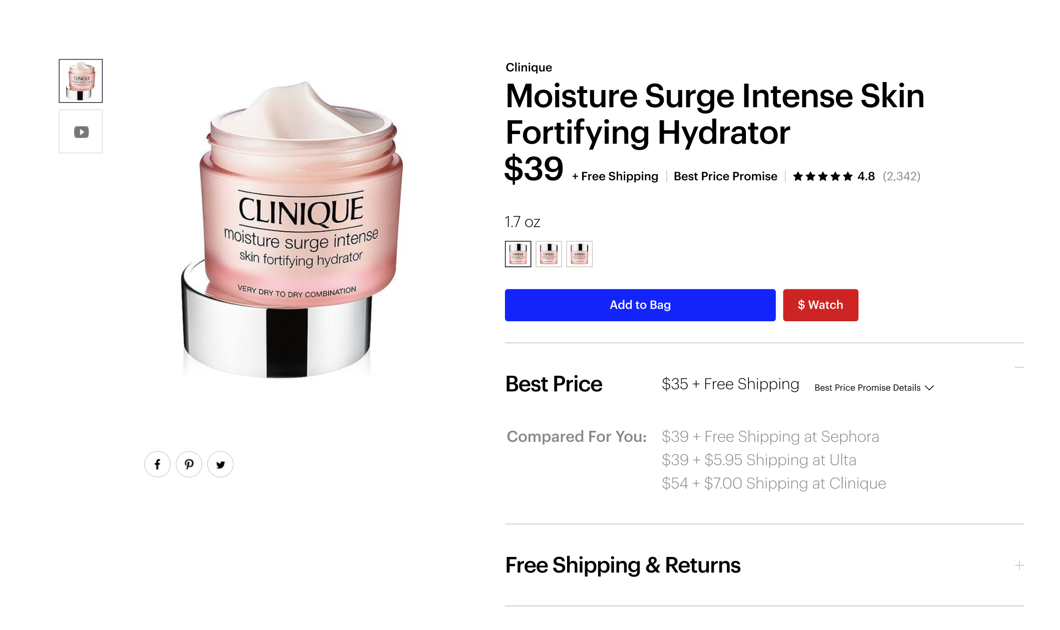
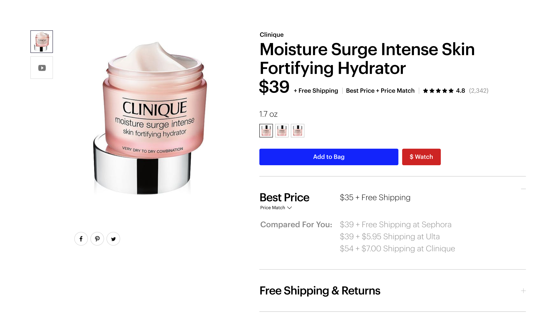
For this next sprint, the exploration focused on sale pricing, price tracking, free shipping & returns, price guarantee and matching and product authenticity.
Sprint 03 : Option 01
Sprint 03 : Option 02
Sprint 03 : Option 03
Sprint 03 : Option 04
Sprint 03 : Option 05
Sprint 03 : Option 06
Sprint 03 : Option 07
Sprint 03 : Option 08
• • •
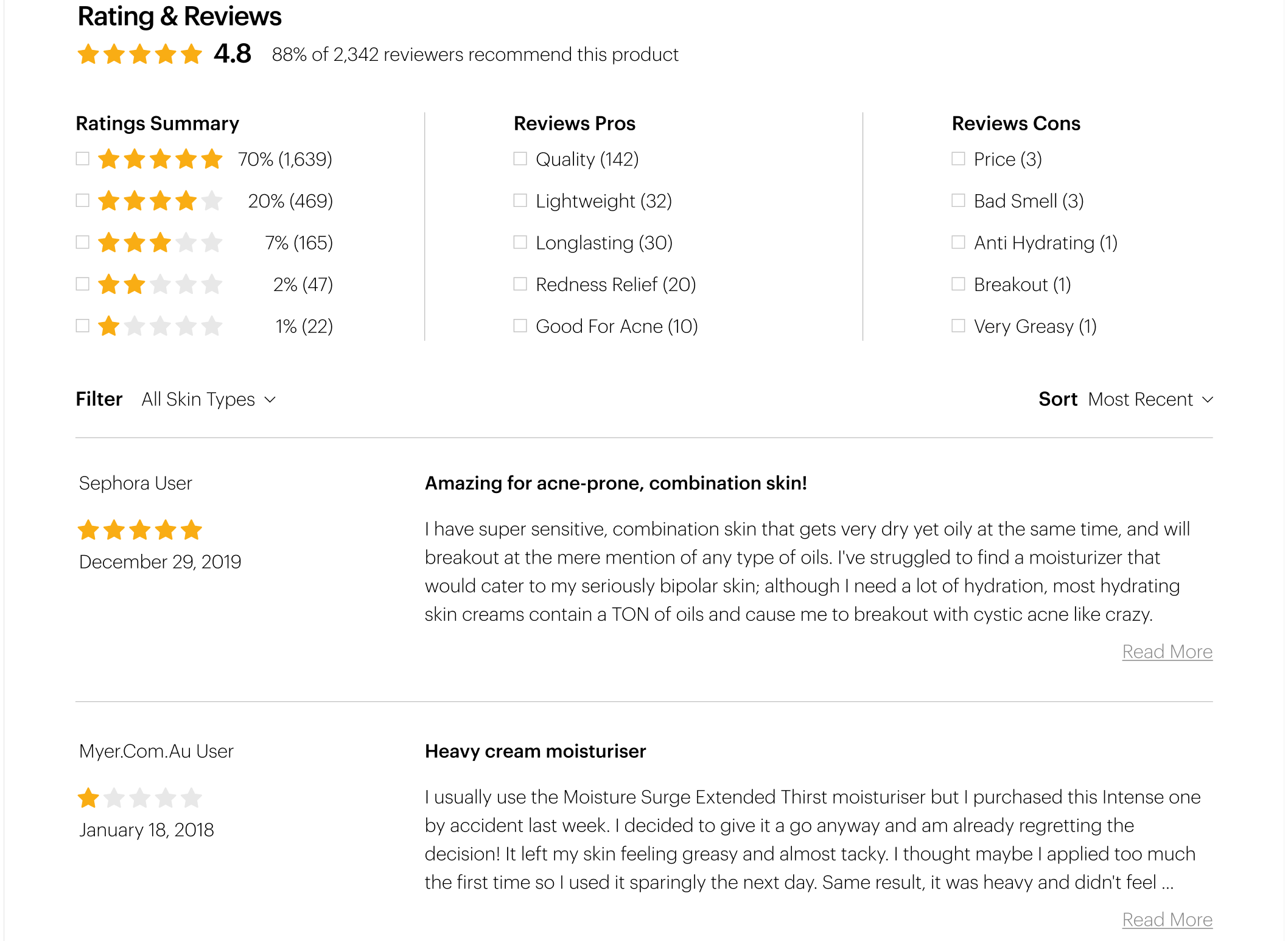
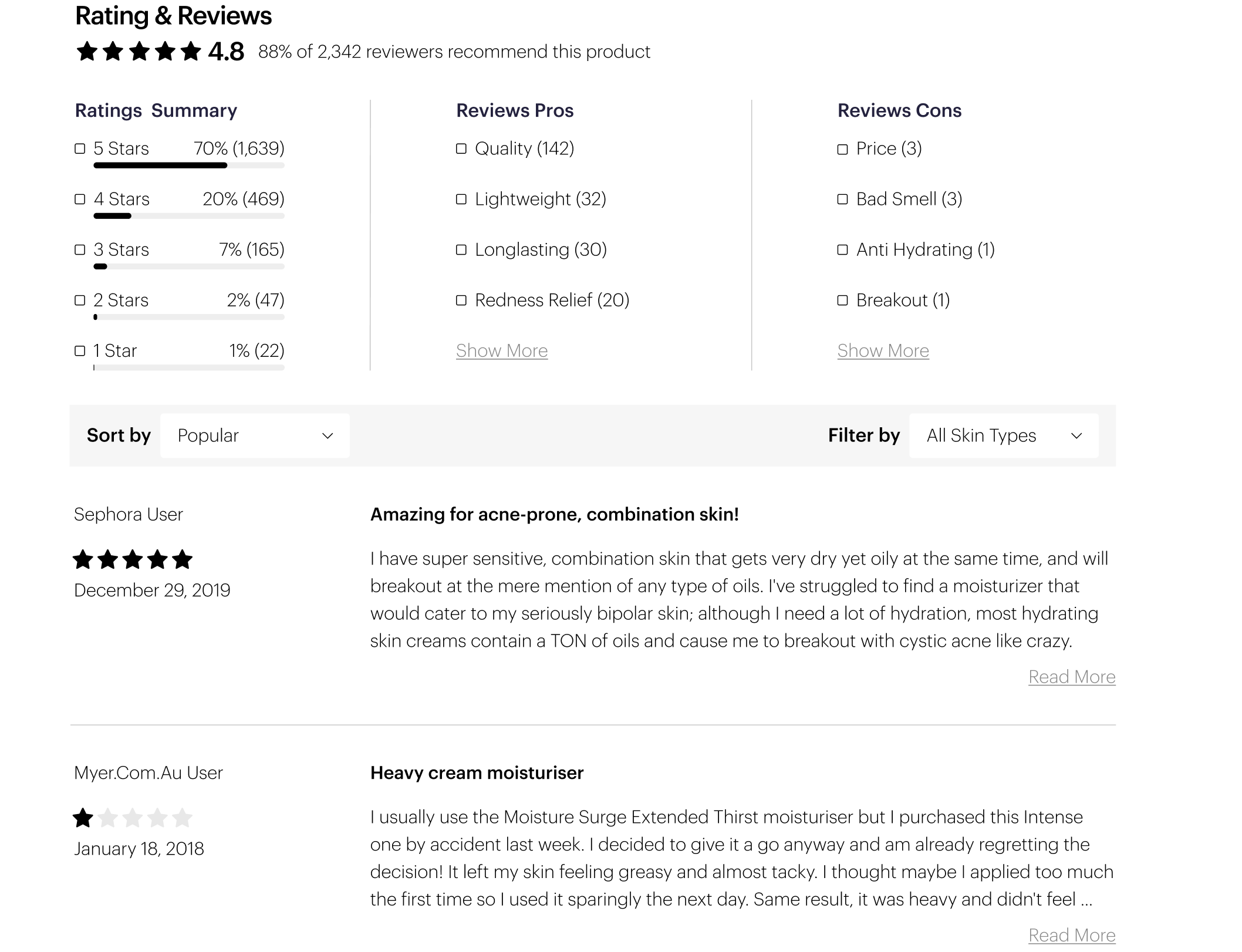
Product Page [ Bottom]
Original Design ▶
Taking this product page feature and making it a more useful experience for the customer. Also, updating the design to be more elevated matching the brand projection of the rest of the site.
• • •
▼ Design Sprint 01
Streamlining complex content, simplifying redundant communication, explore optimal presentation of the elements, improve user usability and overall user experience.
Sprint 01 : Option 01
Sprint 01 : Option 02
Sprint 01 : Option 03
Sprint 01 : Option 04
04 : Usability Testing
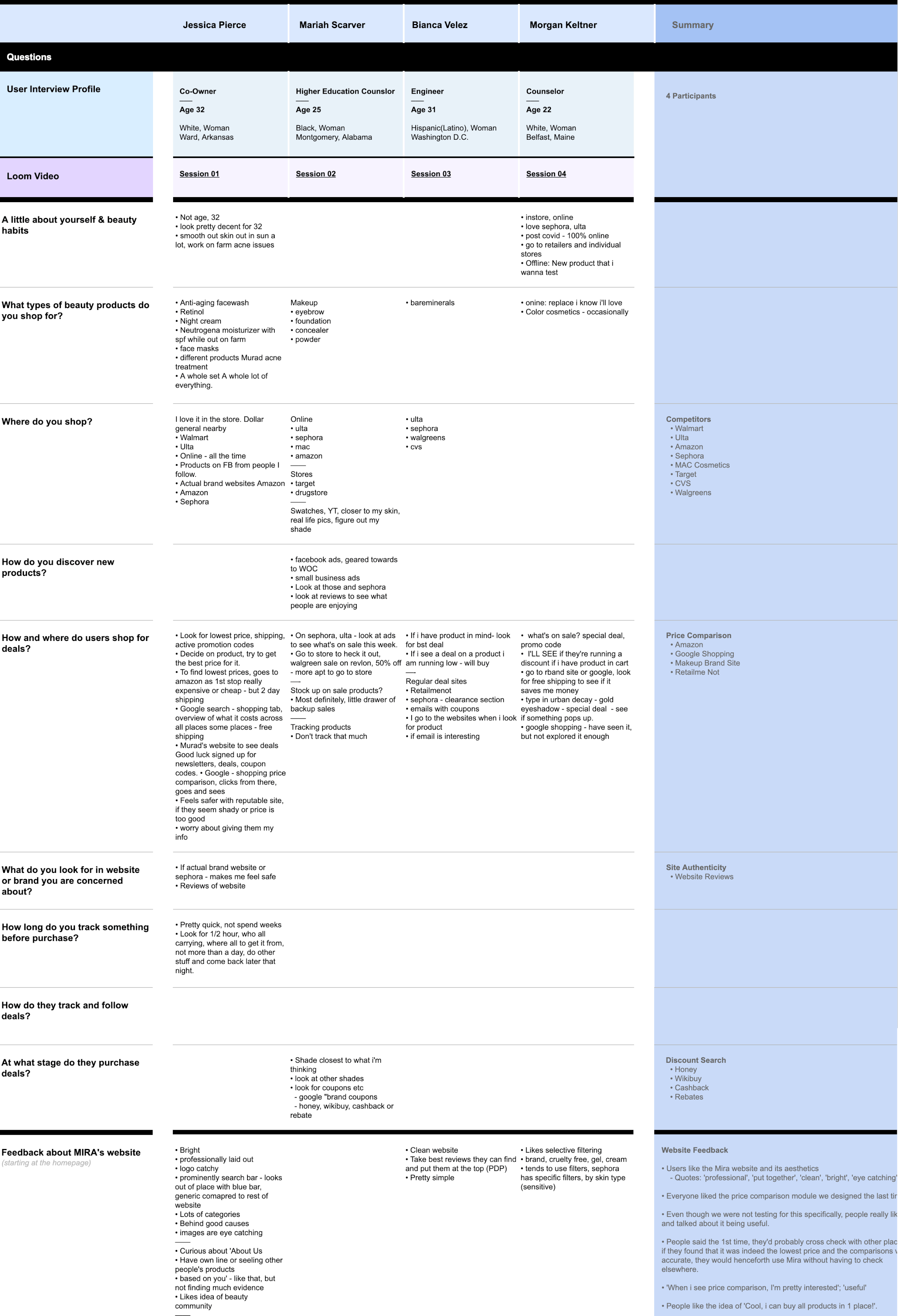
User interviews were scheduled every 2 weeks. During these sessions designs currently in progress were shared with participants. As well as live enhancements deployed to the production environment.
• • •
An example of documentation from such sessions can be found below:
05 : Results
Taking all the above into account and several rounds of iteration, the final designs for the redesigned homepage, search results page and product page template are below:
Final Experience Designs
—— All Project Samples ——

